play
Library Scout
Library Scout is a free discovery tool that helps NYC residents find and save public library classes tailored to their interests.
Public library programming is one of the most underutilized resources in the city. The classes exist, but they're buried across 92 branches with no unified way to browse by interest, time, or learning style. Most people don't even know what's available—let alone what's right for them.
Highlights
Shipped in 1 day, Web App, Solo Build
Recognition
1,192 visitors in 30 days, 8.6/10 satisfaction
Timeline
1-day build, Feb 2026 (ongoing)
Role
Solo Designer + Builder
I led the entire process from problem identification to deployment—researching user needs, designing the OOUX architecture, building with V0, and iterating based on real feedback.
It started with a single TikTok video.
I was sharing the incredible (and often overlooked) classes hidden in the New York Public Library system—and the internet responded immediately. The video passed 100K views and 20K likes. That was my first signal that something was resonating.
I'll be honest: I assumed it was a fluke. Had I really stumbled onto something people wanted?
So I posted again.
That second video pulled in over 1,000 likes and 500 saves. The pattern was clear: people wantedfree, local classes to help them learn skills, work toward goals, and feel connected to their community. They just didn't know where to find them.
The Problem: A Treasure Hunt With No Map
“But the library has a website... right?”
Technically, yes. Practically, it's difficult to navigate.
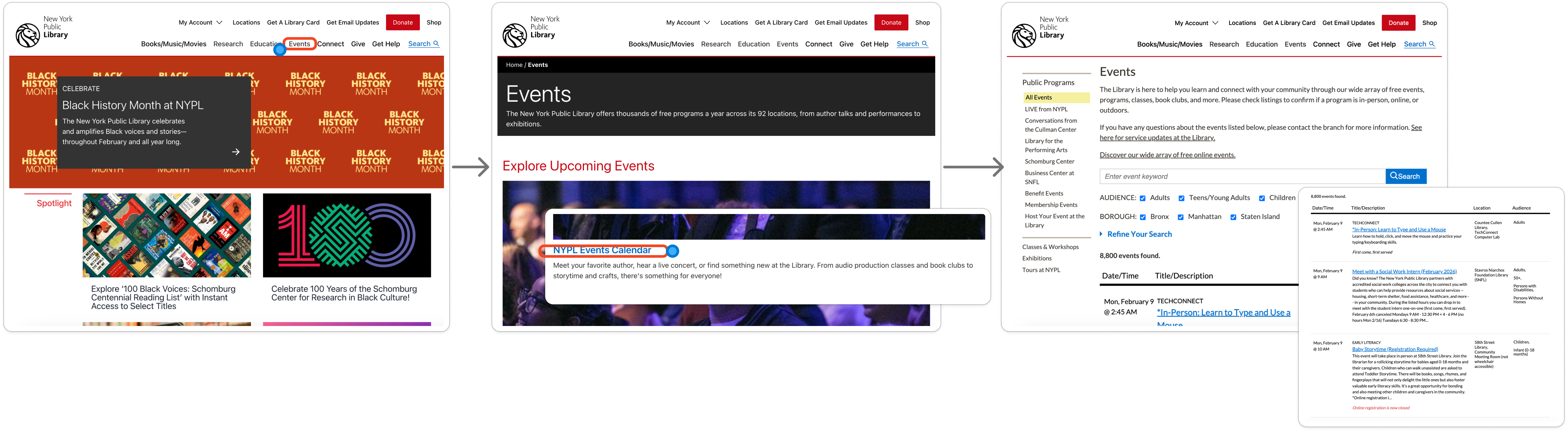
It takes multiple clicks and scrolling just to find the events page. Once there, users are dropped into nearly 8,000 records with minimal guidance. The UI asks people to go on a treasure hunt—without a map.
By the third click and first scroll, most users aren't looking for a class anymore. They're looking for the exit.
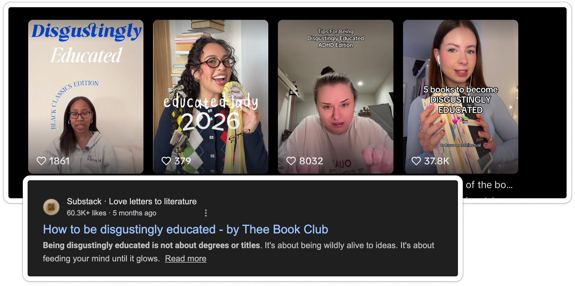
The Cultural Moment
I saw this as an opportunity. Also, as of early 2026, we're seeing a cultural shift toward “building your own curriculum,” analog hobbies, becoming—disgustingly educated, and third spaces surging among Gen Z.
It's a response to automation fatigue and AI-generated content overload. Libraries already support this movement perfectly.
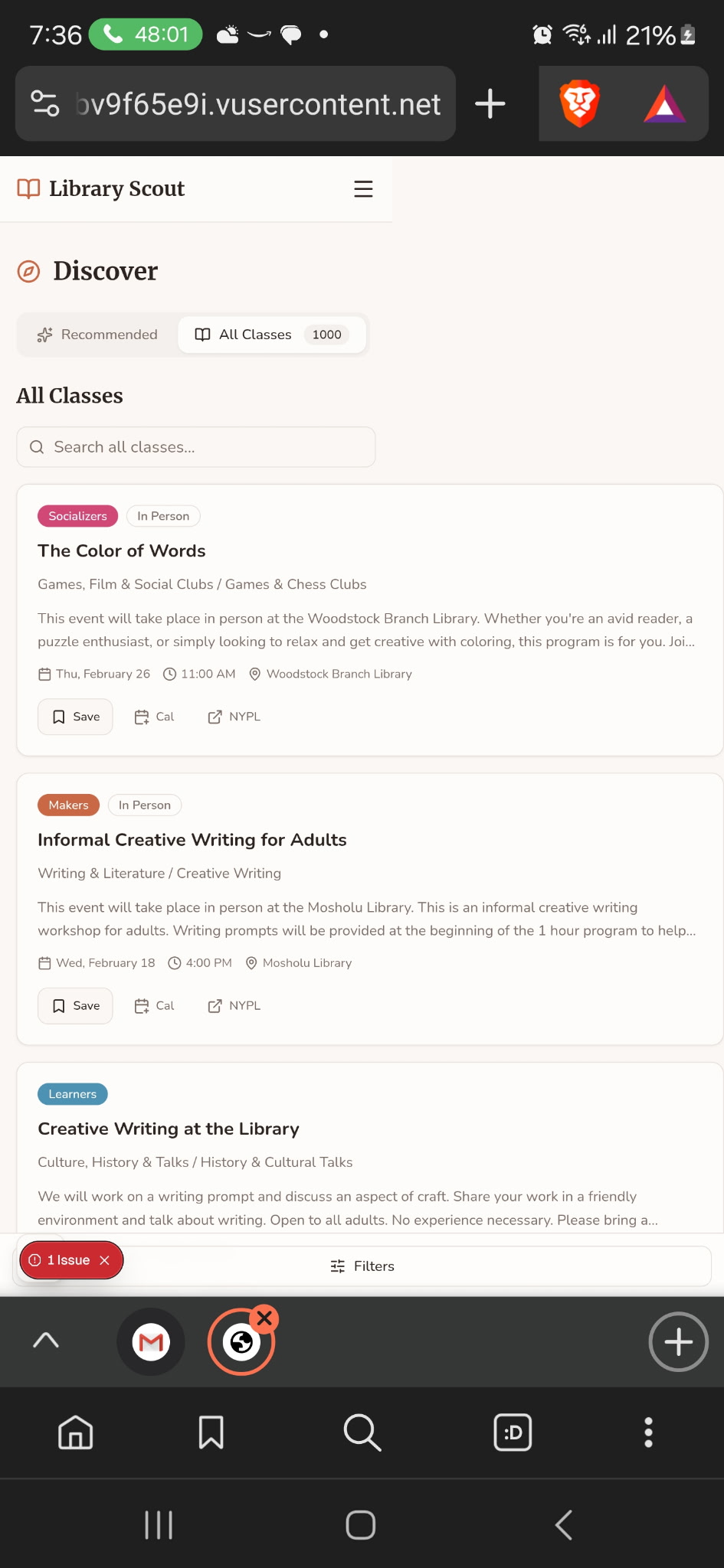
Solution: Reframing the Catalog
Building a New Taxonomy
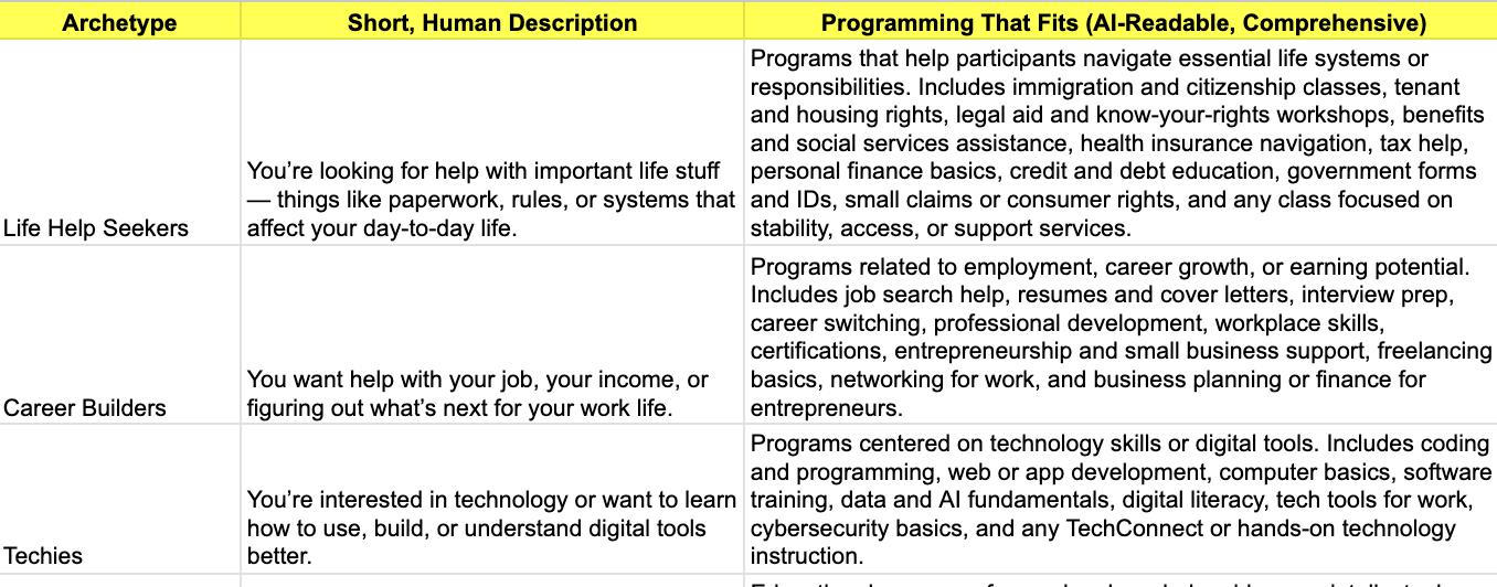
The library's existing categories weren't semantically aligned with how people actually browse or think about learning. So I built my own taxonomy—one rooted in identity and intent, not institutional structure.
I introduced timely, human categories like Cozy Crafts, Learners, and DJs & Producers, then broke them down into Archetypes, Categories, and Subcategories. I added a touch of academic familiarity—labels like Art 101—to make exploration feel approachable rather than overwhelming.
I scraped the entire February class catalog, used AI to assist with tagging, and then manually reviewed and corrected inaccurate records. To make this repeatable, I built a custom classification prompt directly from the taxonomy I designed.
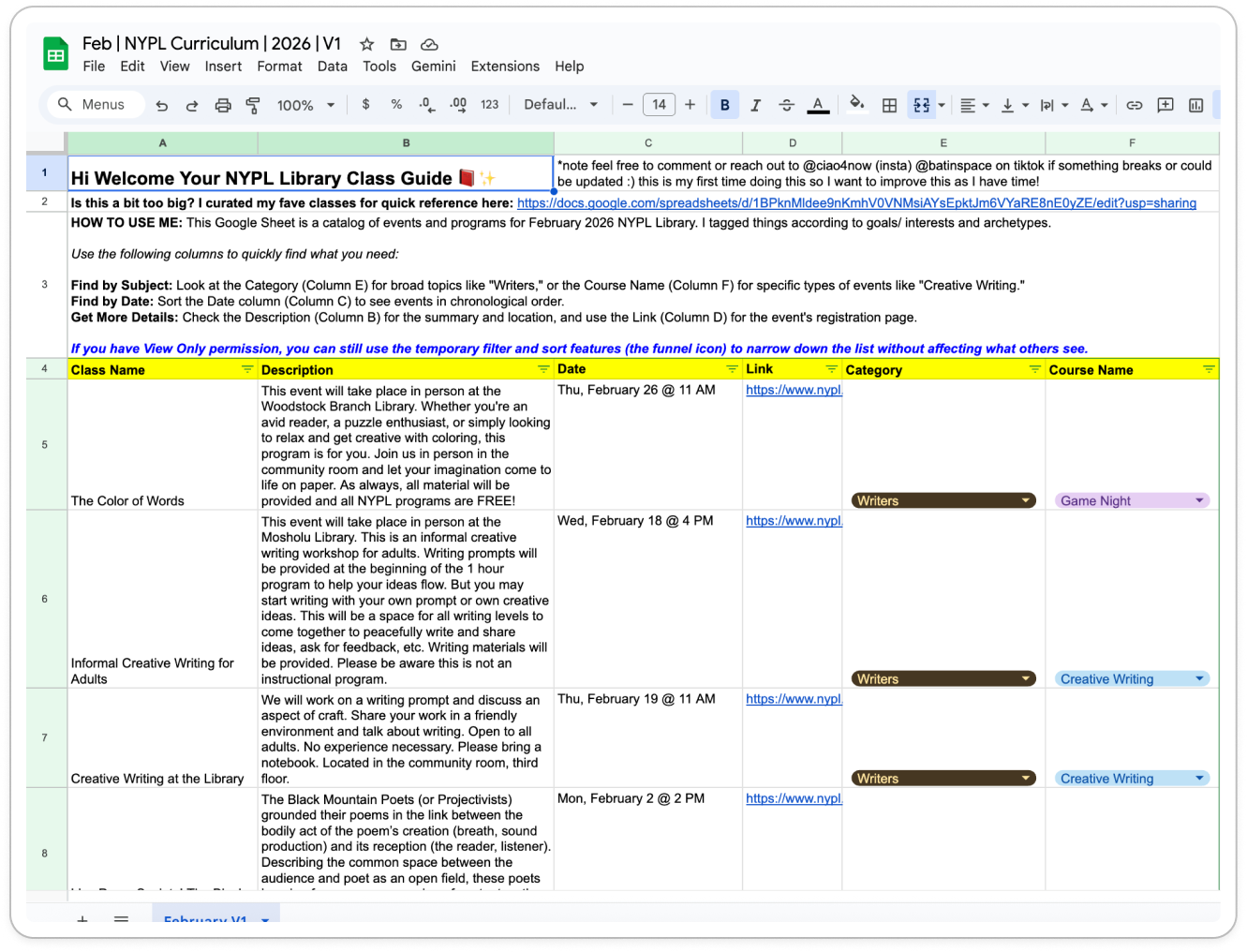
BOOM — I had built my own cheat sheet.
I felt like I was back in college: the person who makes the study guide and sends it around. Except this time, even when I handed people a clean spreadsheet, they still couldn't find what they needed.
Because the truth is—not everyone is good at spreadsheets. The categories helped (and they worked well for targeting the right people on TikTok), but the format itself was still friction-heavy.
...and by stepping away, I was able to understand my goals and high-level features with much more clarity.
If AI was going to build this correctly, I needed to define the DNA of the system before touching a single line of code.
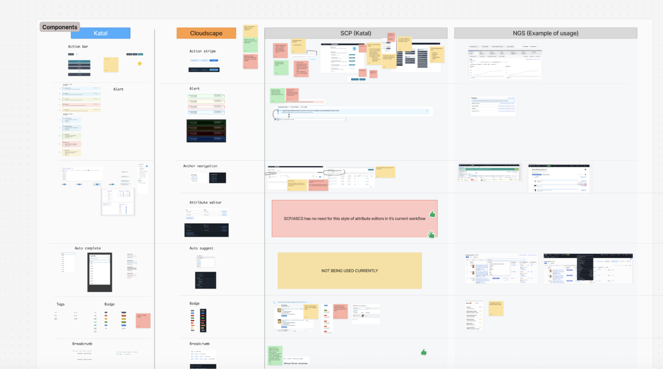
Defining the System with OOUX
One of my favorite tools for this is Object-Oriented UX (OOUX)—a practice that models digital systems around the objects users actually interact with. It breaks complex technical systems down through a design lens, much like how the DOM structures interfaces, making backend modeling more intuitive and aligned with real-world use.
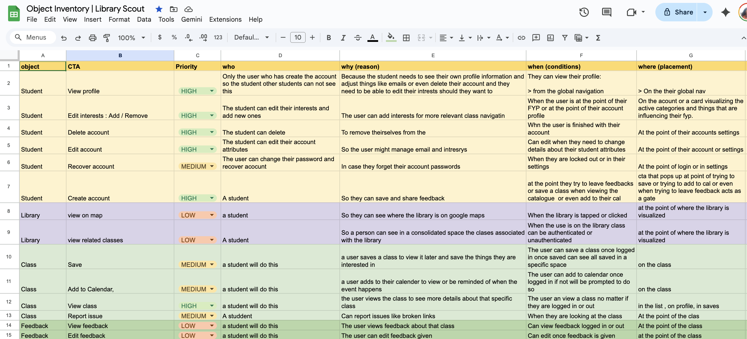
OOUX starts with identifying the core objects in the system—the “things” users come to interact with. In this case, those objects were:
📕The Class:
More than an event; it's an object with attributes like “Archetype” (Who is this for?), “Category,” and “Location”.
👩🎓The Student:
The person building their own curriculum. Their “Interests” filter the entire experience.
🏛️The Library:
A place a student visits and where a class is held.
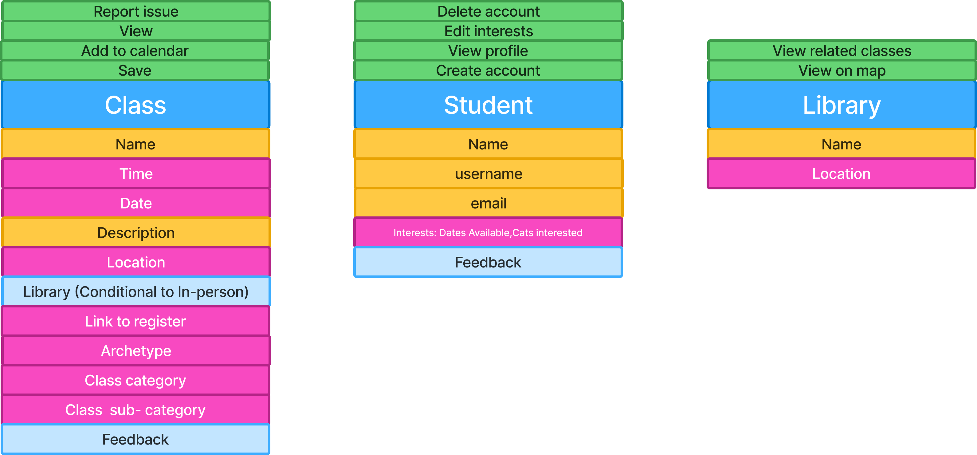
The diagram above shows an object block. Blue represents the object itself, pink indicates attributes (data), yellow represents qualitative information, and light blue shows nested objects.
CTA inventories are especially powerful here. They expose gaps in requirements, surface unclear assumptions, and force alignment early—helping teams ask better questions long before implementation begins.
From this view, I could already see the logic, states, and pages I would need to build. I also knew this would be valuable context to feed into the AI.
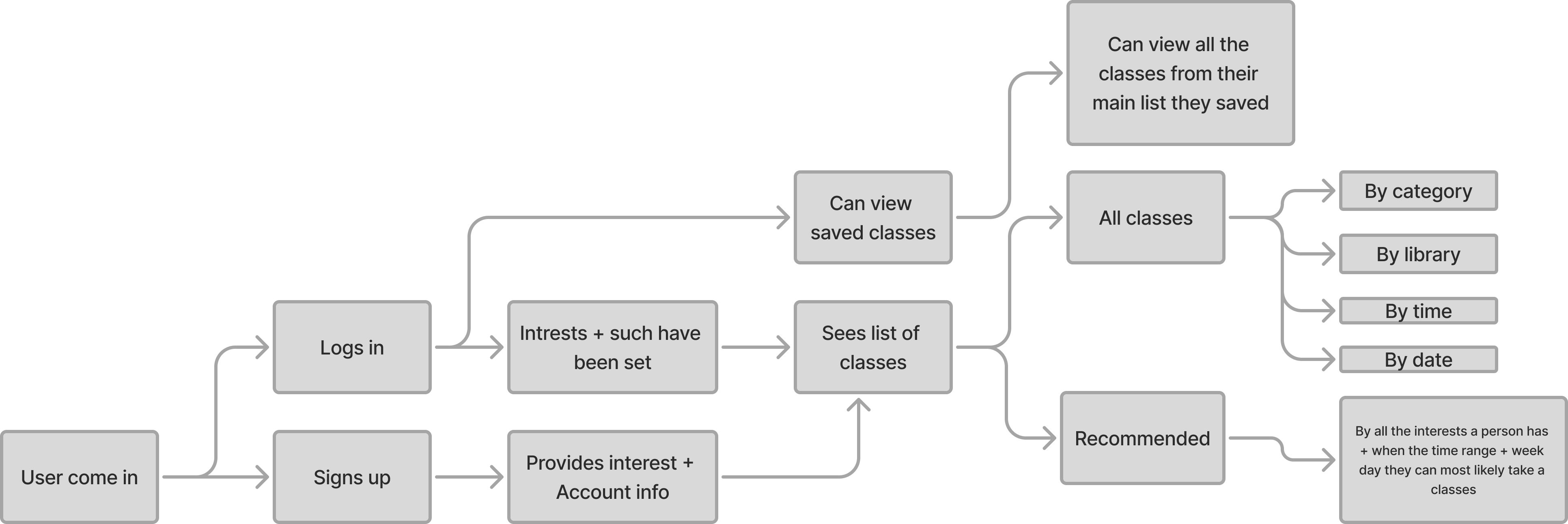
To deepen that context, I created a user flow map to understand how users in different states would move through the system.
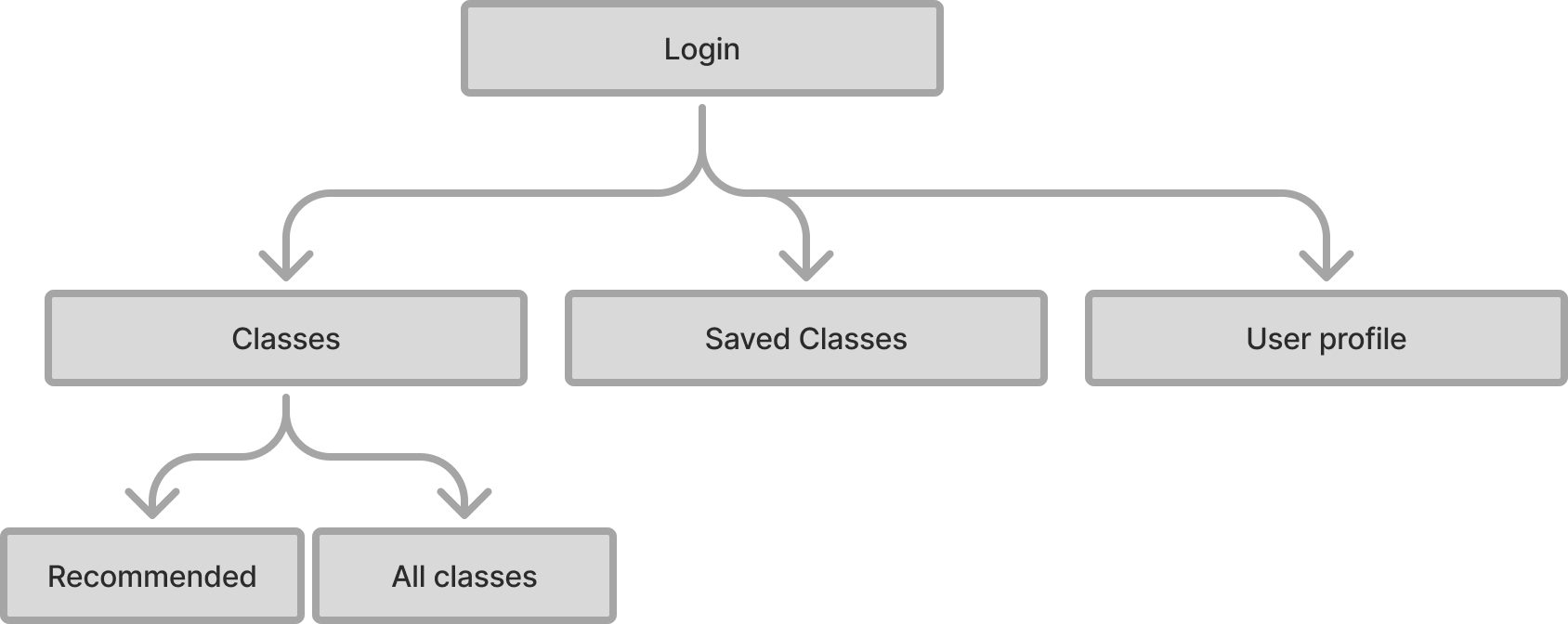
Lastly I made a simple site map so the AI was crisp on how things connect.
Refining the Data Model
Around four hours in, I got a little impatient and shifted focus to improving how I was collecting and modeling the data. I started questioning whether my categories were actually the best ones —and whether there was a better way to structure them.
I spent time working with Gemini to analyze the data and anticipate user needs, refining the categories so they were broad enough to scale but not so broad that they obscured what was actually being offered.
To support more accurate tagging, I also created an AI-readable column of keywords designed to guide the model toward the correct classification decisions.
This part was humbling—and a reminder of why data science is its own discipline.
I learned quickly that tagging performs better in smaller chunksand benefits from scripts and confidence scores to reduce manual review. While I want to reduce my hands-on involvement in this step long-term, it's an area where I know I'll need additional support or automation.
Building with V0
About six hours in, I shifted into vibe coding—bringing the structure to life using V0.
I was pleasantly surprised: the first iteration landed reasonably close to my end goal.
That said, there were implementation details that needed attention. For example, overflow behavior on mobile wasn't configured correctly, and several smaller UI issues surfaced across mobile breakpoints.
Most of my remaining time was spent quality-checking these details and fixing UI bugs. This inevitably became the most time-consuming—and most challenging—part of the build, particularly when it came time to deploy.
It took roughly two hours of troubleshooting to resolve the errors and successfully deploy to a production environment.
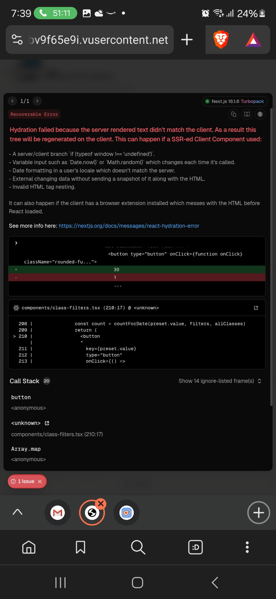
Before deployed to production, I tested the UI across all breakpoints to ensure the interface behaved as intended and supported the core functionality end to end.
So what did the final outcome look like?
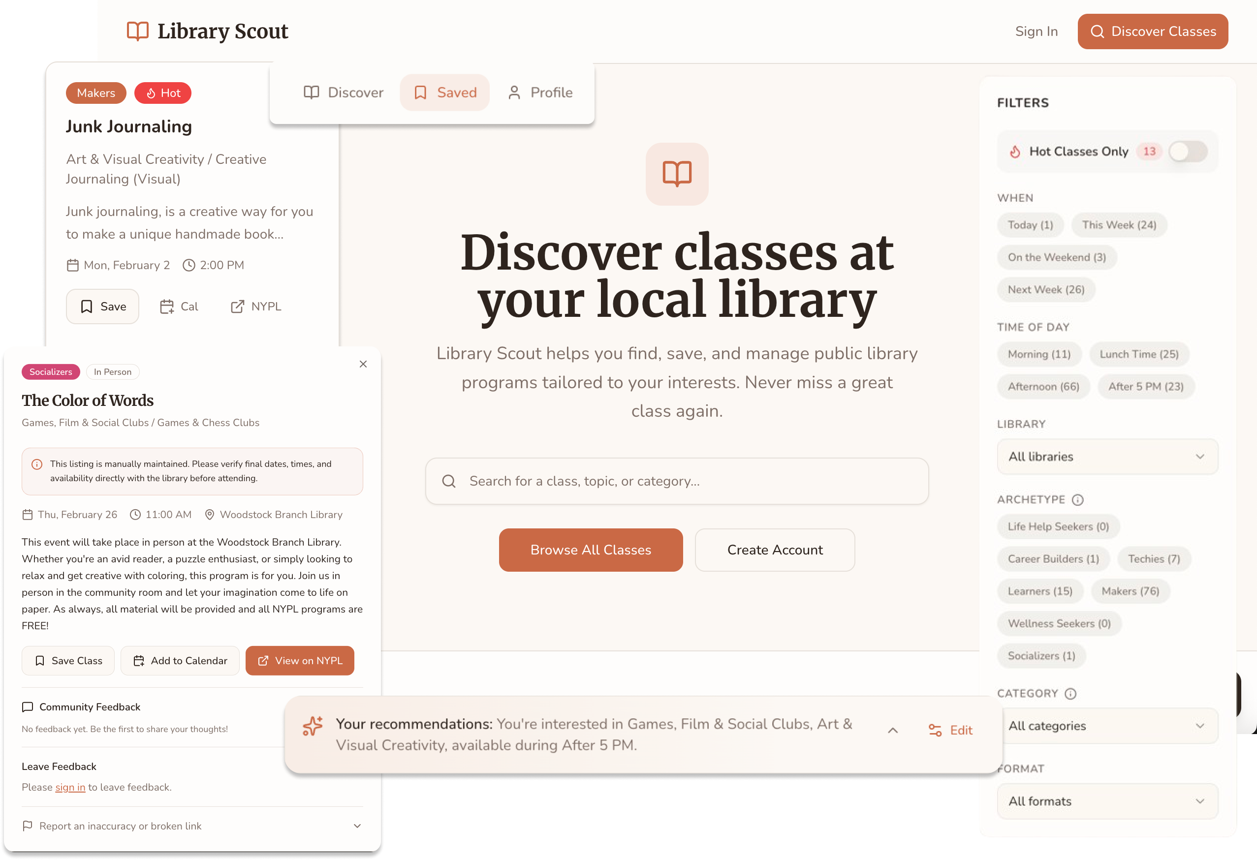
The Final Experience
The final outcome was responsive and prioritized core functionality.
Here's the experience I shipped in under 20 prompts—and $18 worth of credits.
Feature Walkthrough
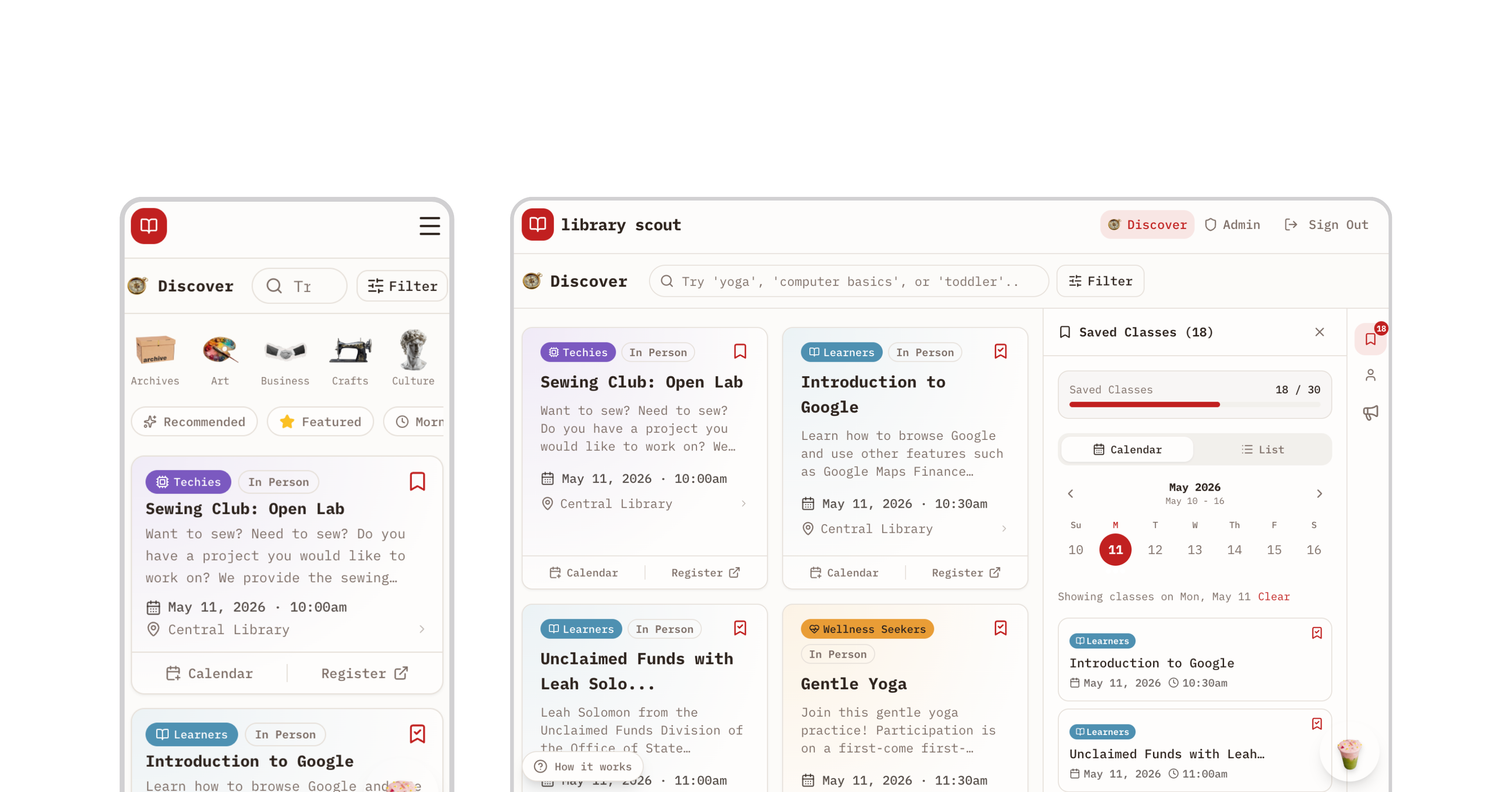
START
The landing page introduces users to the app and immediately invites exploration, allowing them to sample class discovery by browsing the catalog.
PREFERENCES
After logging in, users personalize their experience by selecting interest categories, learning archetypes, and preferred times—powering a Discover page tailored to how and when they want to learn.
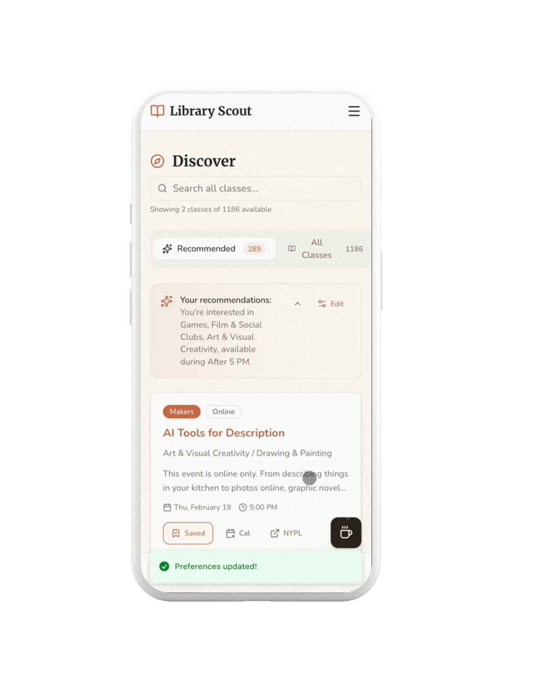
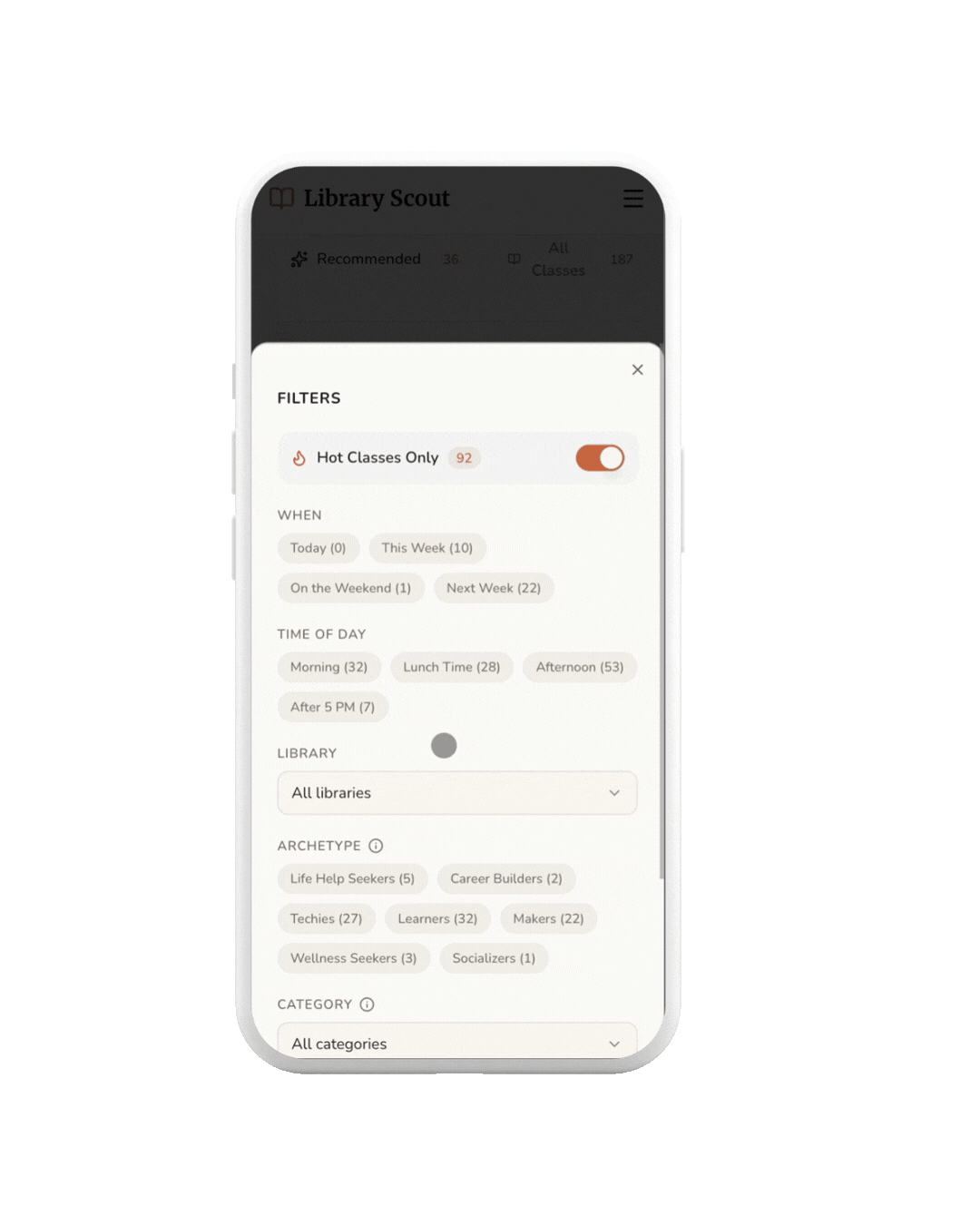
FILTER
Users can use filters to quickly narrow results by time of day, making it easier to find classes that fit their schedule.
DETAILS
When a class catches a user's interest—such as this DJ-ing session—they can click in to explore more information.
INTEGRATION
When clicking the link it opens a tab to the library.
CALENDAR
When clicking the calendar - it downloads and ICS that can be added to any calendar app.
SAVES
The user could have also saved the class to be accessed through the saves.
ACCOUNT
Users can manage their preferences, update availability, and adjust settings from their account page.
Impact
Library Scout went live in February 2026 with no launch campaign, no paid promotion, and no marketing budget.
1,192
visitors in 30 days
+511%
traffic growth
8.6/10
avg satisfaction
The most telling signal was the referral traffic breakdown. Google was the top source. That's organic search finding the app without any SEO work, which means the problem has real demand that exists independently of social media reach.
I've been building Library Scout in public, sharing the process and testing openly on TikTok. That approach has given me something more useful than a traditional feedback cycle: a running signal on what resonates, what confuses, and what people actually want to do with it.
“I have been wanting a tool like this. It's crazy that the city hasn't built something like this.”
Early user, April 2026
Five early users submitted feedback through an in-app survey. Three requested follow-up interviews.
The most consistent request was geographic expansion. Two users independently asked for Brooklyn and Queens coverage without coordinating. Bug reports surfaced real implementation gaps, all of which have since been addressed: tooltip rendering on long library names, pagination scroll behavior, and preference tag removal.
Additional requests (OAuth, monthly calendar view, a native app) are informing the next phase.
Key Learnings
- AI tools reward fundamentals: The hour I spent mapping objects and user flows before writing a single prompt was the highest-leverage hour of the day. Preparation is the skill.
- Think slow to act fast: Stepping away early felt like losing time. It saved it. Every phase after the architecture work moved faster because the decisions upstream were already made.
- Data work is the real constraint: Tagging 1,000+ rows is not a one-pass job, and even 70% accuracy is meaningful. I underestimated this scope on day one.
- Visibility isn't just about exposing data:A spreadsheet of library classes is the same information as the library's events page. Neither one answers "what should I take?" The taxonomy and archetypes are the product.
- You can ship a lot in a day: But phasing produces better results. The build validated the concept fast. The next layer gets built on that foundation.